Pave Money
Automating financial savings for the young workforce
Overview
Context
The founders of Pave money approached me with an idea to cultivate the habit of saving and investing money in young users aged about 18-25. The app would essentially enable users to save money (as low as ₹ 10) regularly into a liquid fund backed by ICICI Prudential.
Research
Identifying user challenges
Combining the research conducted with some assumptions, we identified three key problems the product had to serve
Finance as a concept is considered intimidating and complex, making financial literacy very rare amongst young users
Research
Understanding the fundamentals of saving
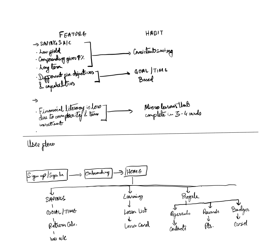
Based on the information and research we gathered (albeit from a small sample size) we started outlining the core features of the application. The constraint we dealt with was the stable, and therefore, mundane nature of the savings product. It was a stable long term investment, meaning the returns were akin to a typical savings account. This low yield investment product needed consistent savings habits to leverage the power of compounding.
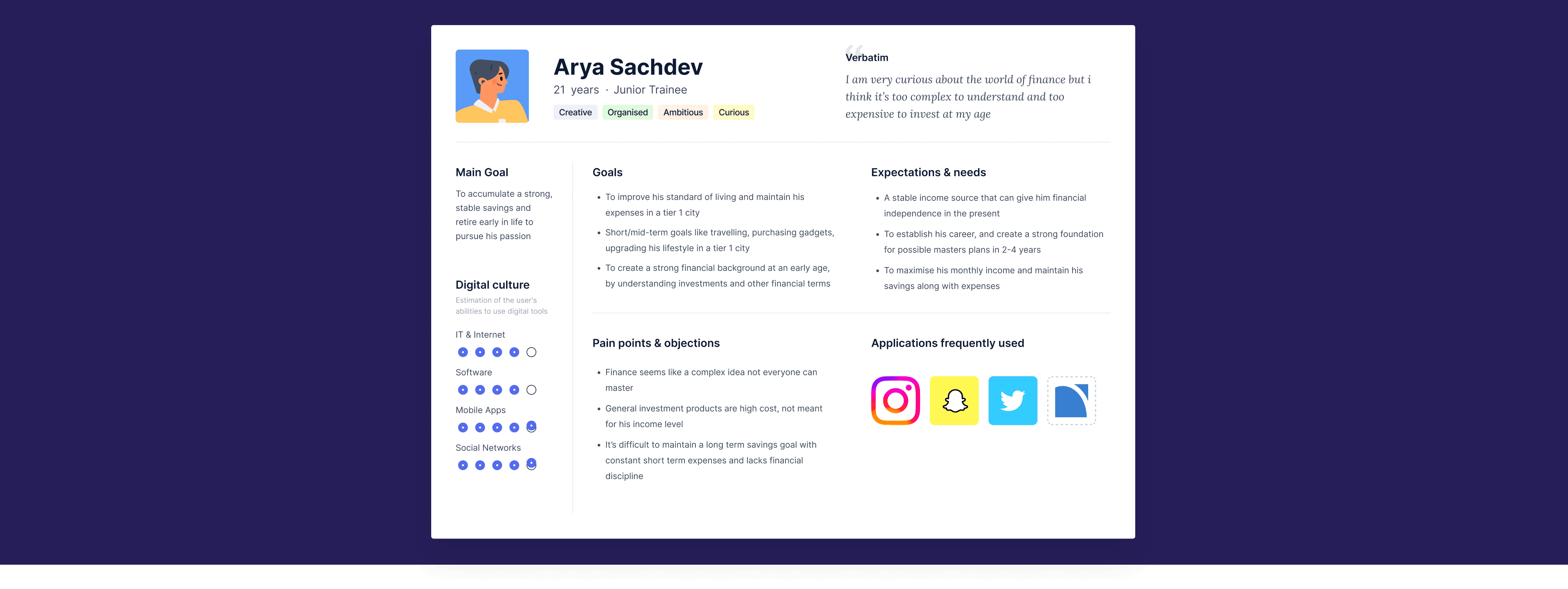
Defining the user persona
We created a user persona on the basis of this feedback to summarise and derive key insights that can further help us design the priority features and use cases of the application
Analysis
Creating the MVP outline
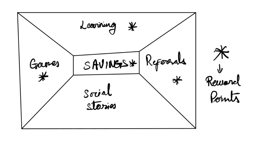
We realised that the true value of the application lied in it's ability to not only create but also maintain a consistent savings habit. So we designed the features primarily around rewarding them for consistently saving, and engaging them with more knowledge and games to familiarise them with the broader idea of financial security.After brainstorming, we decided that the MVP of the product would have 2 main functions :
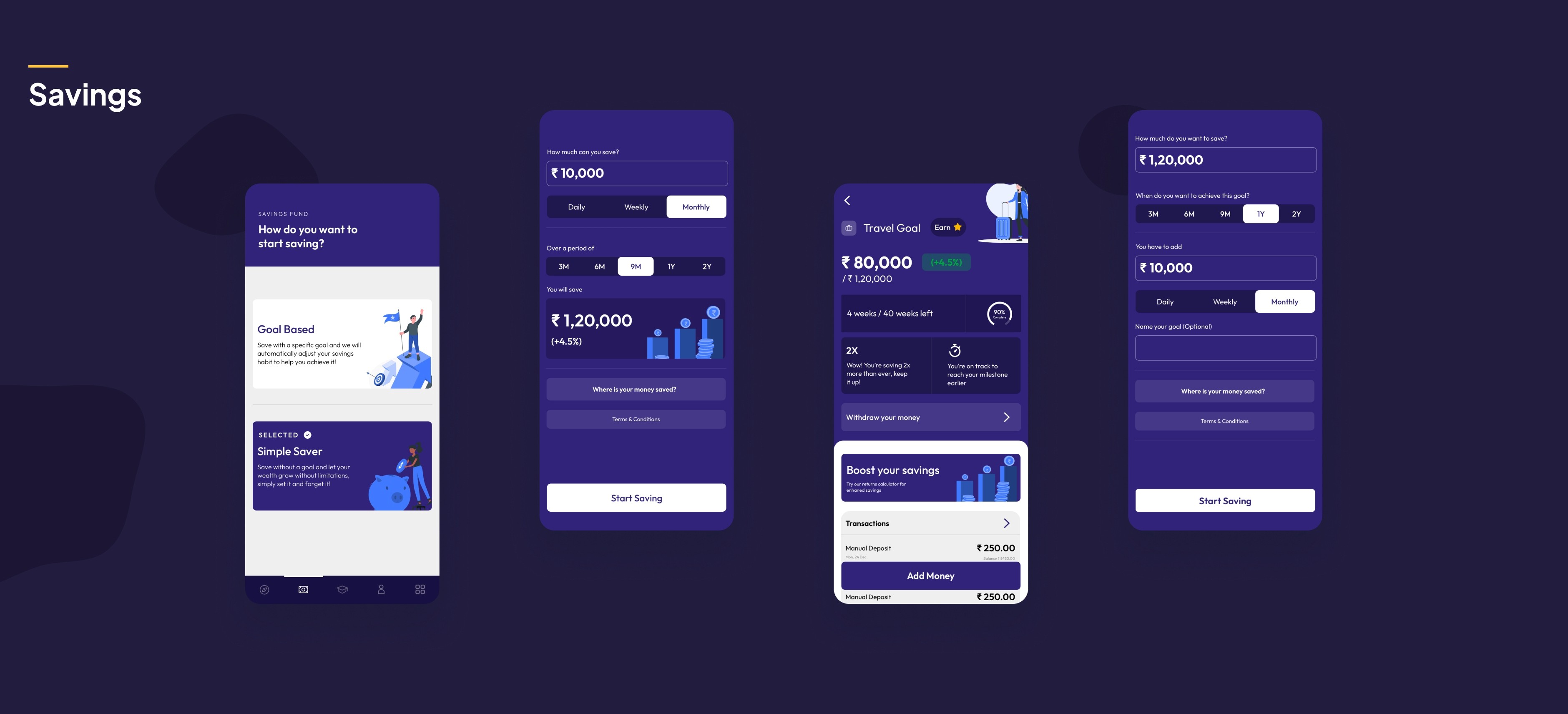
Customisable savings based on specific goals or timelines with a dynamic return calculator
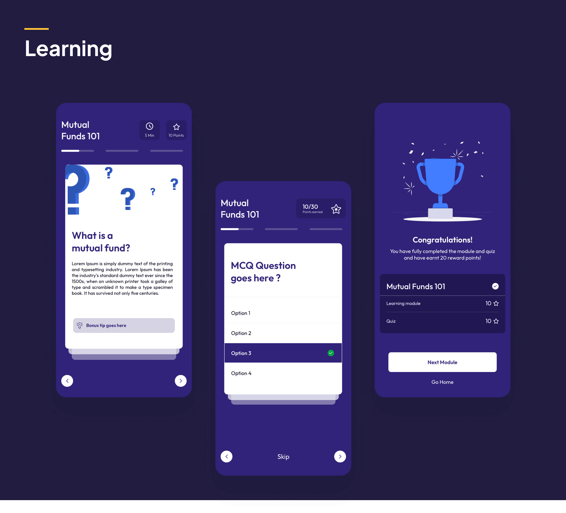
Engagement features like micro lessons and interactive games tied by a reward system
Design
Product features
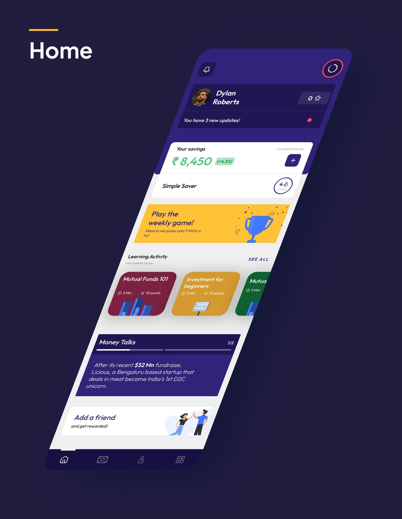
We identified the key features of the application and placed them in order of priority for the user across the app
As finance is considered a complex field, we wanted to simplify and present the essential concepts through a swipe-card based module, even adding a questionnaire with rewards to encourage progress
Transparency
We designed the savings and learning modules in a way that represented essential information about finances with complete transparency, as a step towards familiarising users with finance and making it approachable
Profile
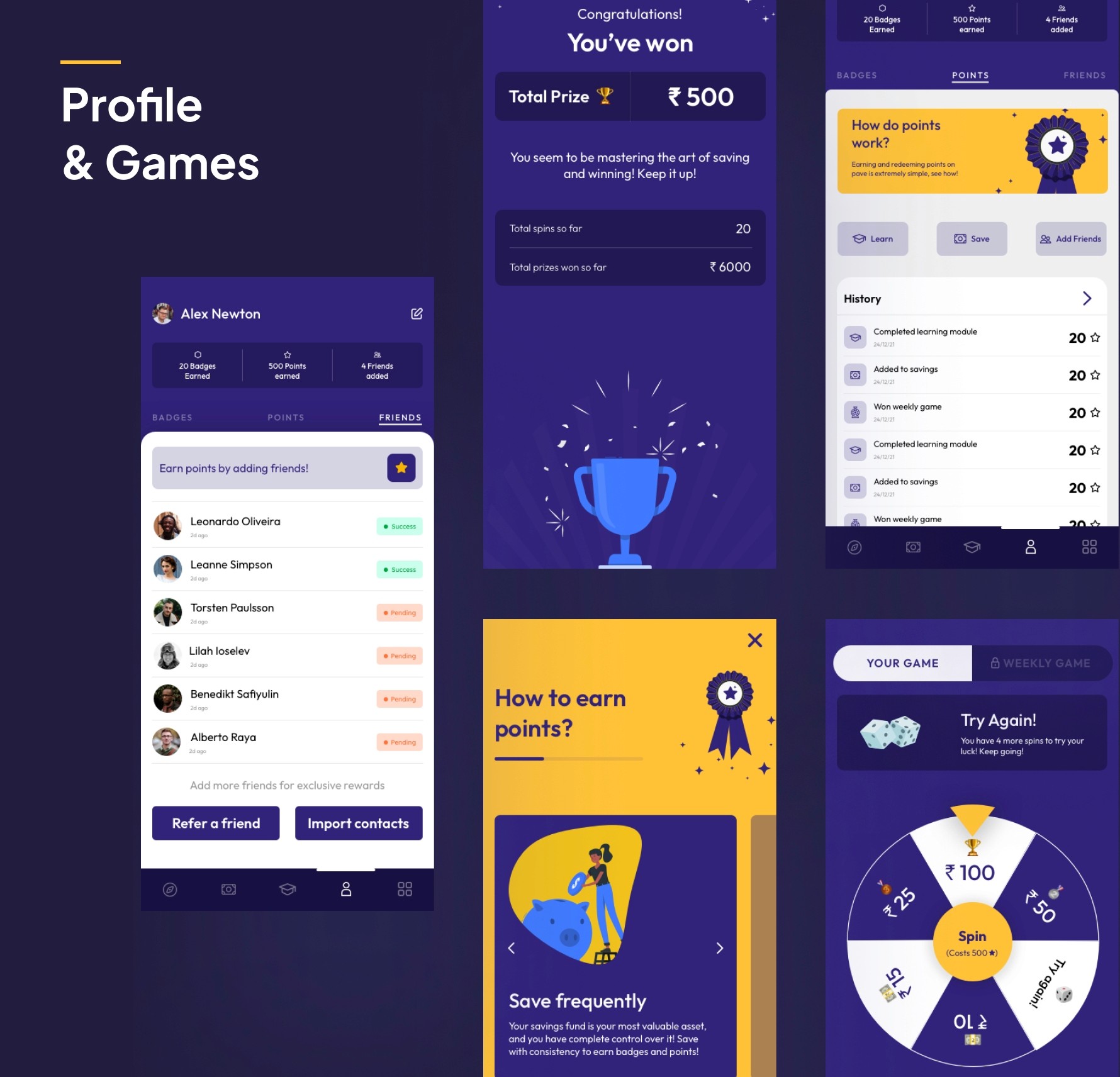
We visualised users' progress through points and milestones through custom badges that would engage them and encourage consistency over time
Social
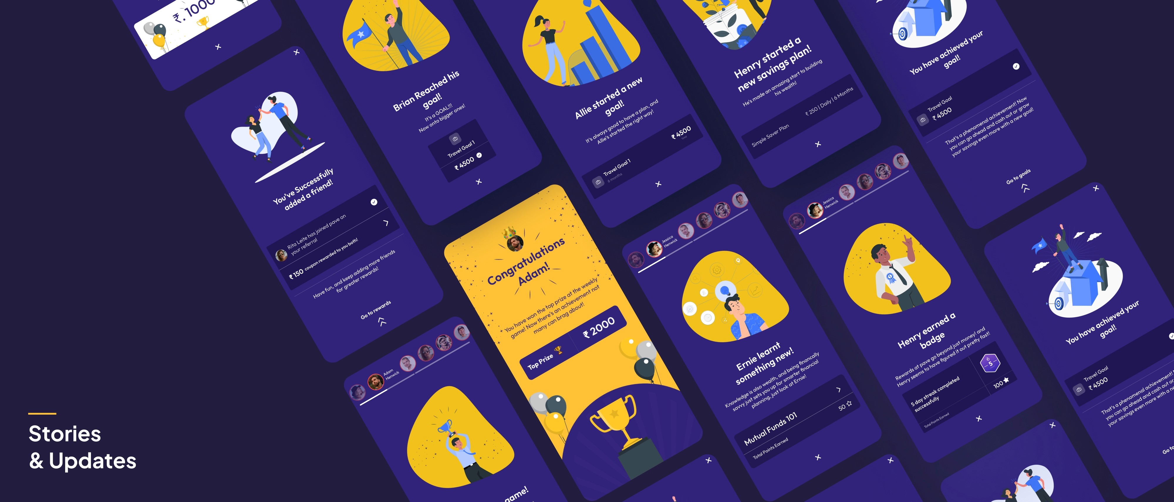
We made the app unique social with a user referral program. In order to boost engagement and consistency, I opted for a story-like design to showcase individual achievements between friends
Design
Final MVP
Interface
